How to boost a Life Insurance Marketplace
ROLE / PRODUCT DESIGNER
XP INC / 2021 - 2022
Overview
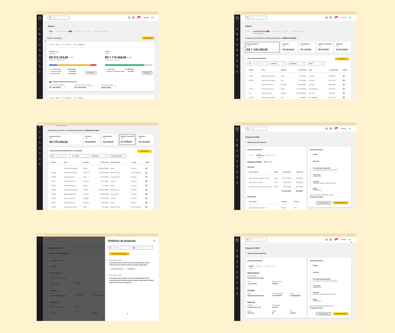
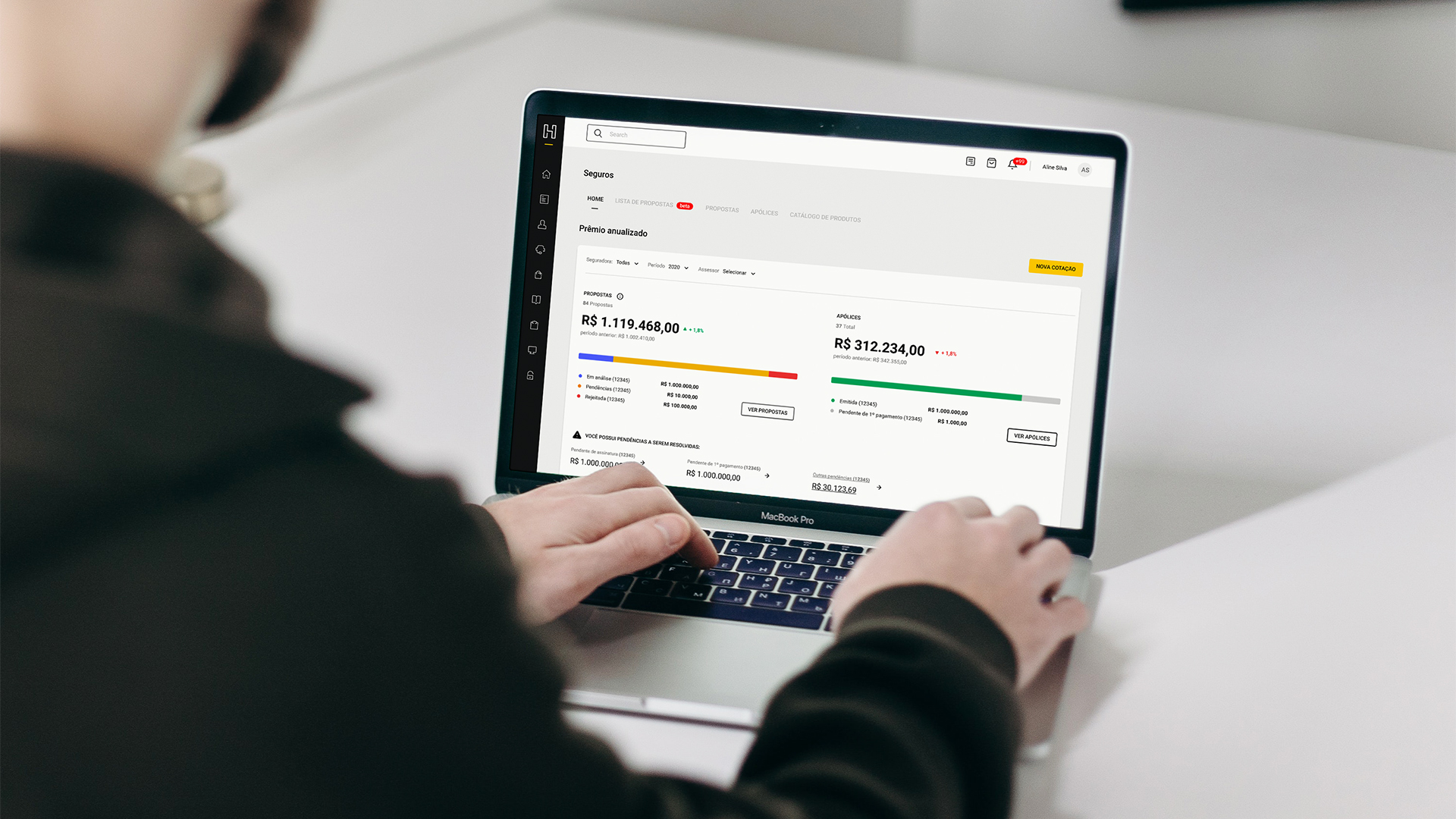
I took part in one of the first multidisciplinary teams at XP Inc. that focused on insurance products. And our first goal was to redesign the XP Platform, called "Hub", which was the main marketplace tool used by advisors to sell financial products to customers.
MY CONTRIBUTIONS
1. Identify user needs and business opportunities to discover why advisors didn't access XP Platform and to build the digital strategy;
2. Create a new standard experience based on the user research;
3. Build a design culture (many stakeholders have never worked with designers);
4. Estimulate data culture (we started with almost no metric);
5. Validate business and design hypotheses through mainly quantitative user research.
Outcomes
21%
User satisfaction growth
11%
Number of contracts growth done by XP platform
4.8
Average user satisfaction
-29%
Cycletime reduction (time to conclude an insurance contract)
01.
Why redesign the platform?
HOW TO BE MORE PROFITABLE THROUGH DIGITAL PLATFORM REDESIGN
XP platform, called "Hub", is a marketplace that was built for advisors to sell many kinds of financial products. However, the advisors who specialized in life insurance didn't access it because they used to access other insurance companies' platforms, mainly to generate contracts.
This fact was a big issue for us because just 5% of the contracts that we administrated were done by Hub. If these were generated by the XP platform, we could impact the number of commissions and fees, and consequently be more profitable for XP Inc. That's why we decided to invest in a redesign.

02.
Planning the digital strategy
UNDERSTANDING OUR USER BASE
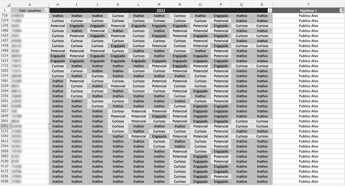
We decided to study the users to understand why they didn't access Hub. We analyzed the user base to classify the users into categories based on Hub's traffic: engaged, potential, curious, and inactive.
We wanted to transform the curious user into an engaged one offering great insurance coverages and prices, at the same time, a complete digital experience on Hub. So, we started to do user research and product discovery to find user needs and business opportunities.
03.
Discovering Hub's barriers
4 MAIN BARRIERS THAT MAKE IT DIFFICULT TO ENGAGED THE USERS
During our design process, we discovered some barriers that make it difficult to advisor access Hub frequently. The 4 main barriers navigated through Hub's backend and frontend, like data accuracy and features missing.
We understood that we needed to plan plenty of initiatives for all barriers. So, we prioritized these initiatives to start the redesigning.

04.
Exchanging constructive feedbacks
DESIGN CRITIQUE WITH THE MULTIDISCIPLINARY TEAM
Some of my peers have never worked with a product designer up to that moment. That's why one of my goals was to build a design culture with other designers and stakeholders.
I started applying Design Critiques, mainly with product managers and engineers, to show how a designer thinks when building interfaces. It was a valuable experience because we reduced the number of remaking and increased the team's satisfaction. The stakeholders felt that they took part in building the experience.

05.
Comparing different products
COMPARING PRODUCTS TO FIND THE BEST PRODUCT FOR THE CUSTOMER
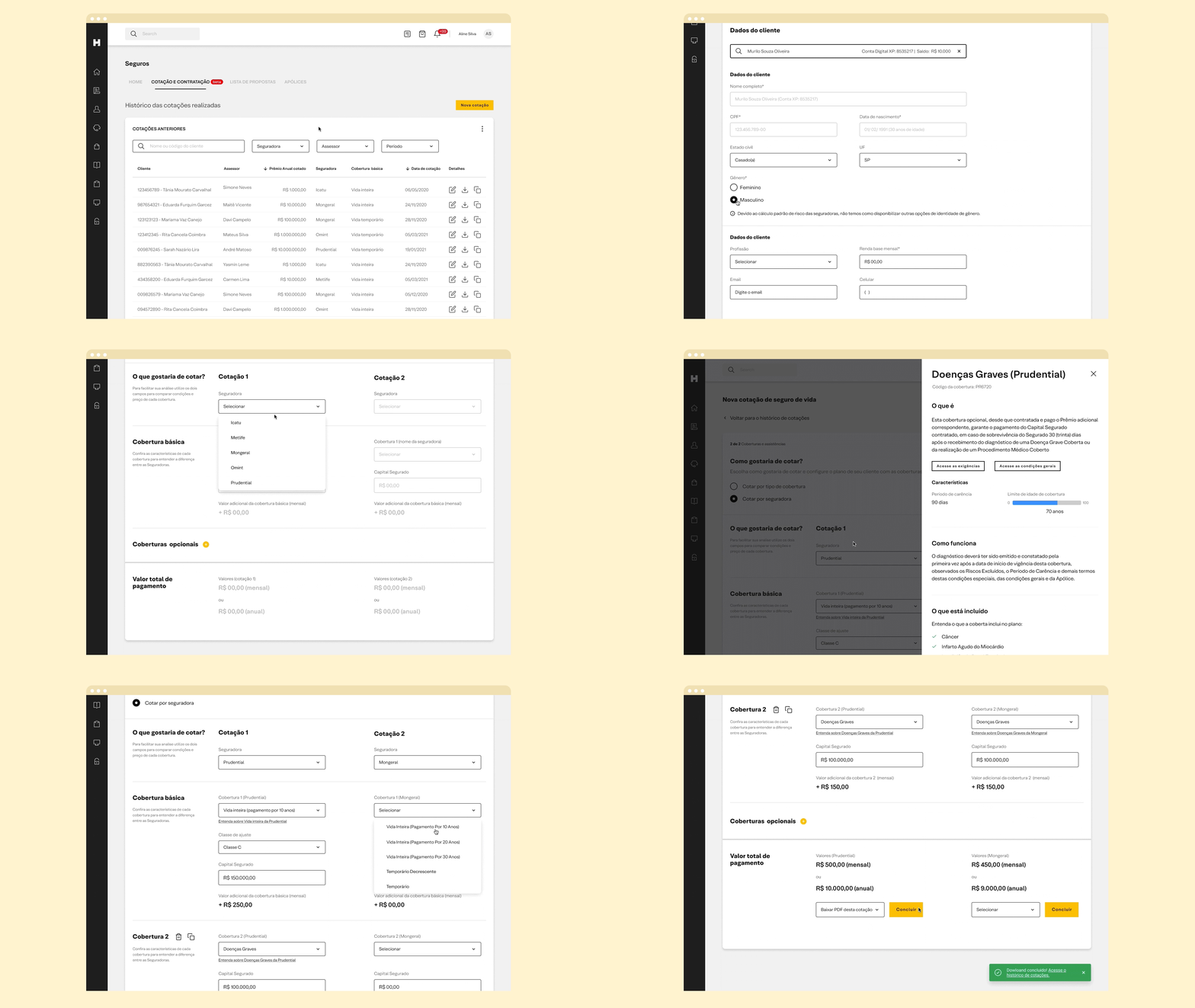
One of the identified opportunities is a feature to help the advisors compare different products to find the best for the customer. We decided to invest effort and time in this feature even though we knew that it could be very complex to build it because there was no service like this in the Brazilian life insurance market.
As a result, the feature brought plenty of coverage and prices of 6 insurance companies and provided information about the products to help to educate the beginner advisor. This way, the advisor could analyze the best plan for the user's life moment and financial conditions.
06.
Reducing the cycletime
ADMINISTRATING THE INSURANCE CONTRACTS
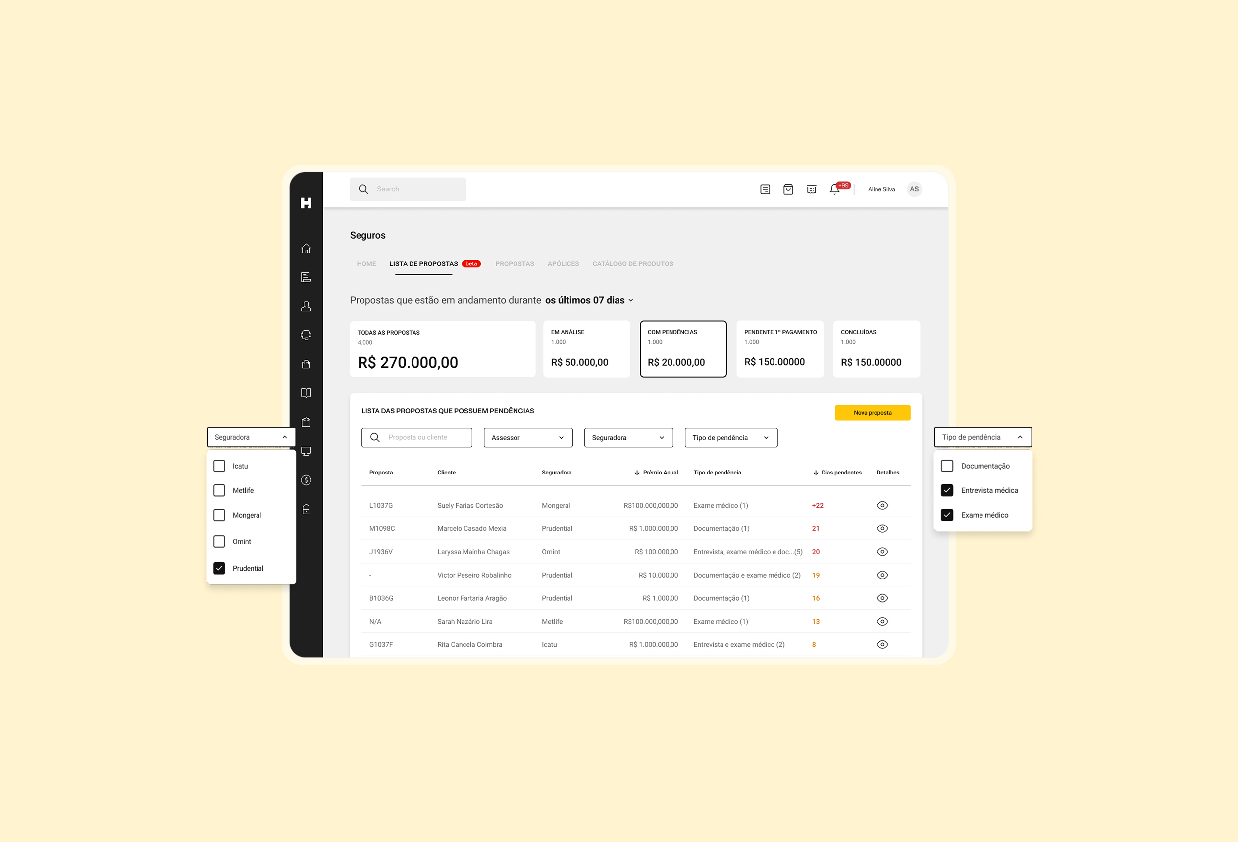
During the steps to generate one insurance contract, we can find a lot of stages that can postpone the contract conclusion, such as the exam necessity to confirm the user's health or delay payments.
We provided information with details about all contracts to simplify the user's tasks (lead to beginner advisors), and we developed other features to improve the user journeys.


07.
Results
OUTCOMES
Redesigning the XP platform wasn't so easy because we had a lot of old codes (legacy). We took more than 1 year to rebuild all features and include other ones.
As a result, we increased 21% the user satisfaction and 11% the number of contracts made by Hub.
EXPERIENCE BEFORE AND AFTER

LEARNINGS
Started working at XP Inc. during the Covid pandemic was a challenge for me because it was my first time working remotely with a new team. I needed to find some ways to build connections and relationships with coworkers.
