
Consortium in a simple experience
ROLE / PRODUCT DESIGNER
ITAÚ UNIBANCO / 2020
Overview
The consortium is a complex product for customers but when acquired correctly, it can help a lot in reaching life goals.
The big challenge was to build an auto-service on Itaú's website for the customer to simulate and hire this product. This journey should have a simple solution, especially about the content so that the customer felt comfortable and awared of the decision when acquiring the consortium.
MY CONTRIBUTIONS
1. Analyze old user researches and project documentations;
2. Identify the main user and business needs;
3. Analyze the old experience and identify opportunities to improve the journey;
4. Build wireframes and prototypes;
5. Plan and apply user tests and analyze the results;
6. Create an experience design handoff, including accessibility.
01.
User and business needs
UNDERSTANDING THE PRODUCT
In short, a consortium is a form of acquisition, based on the union of people who have the common objective of acquiring a product or service, in which each person contributes with a monthly amount.
The problems were based on two moments:
1. When the customer analyzes and understands the product;
2. Itaú's detailed analysis to identify the risks on providing or not a value to the customer.
The high number of business rules makes this product complicated. For example, one customer can be raffled as soon as he starts paying or only at the end of that payment.
02.
Analyzing the old experience
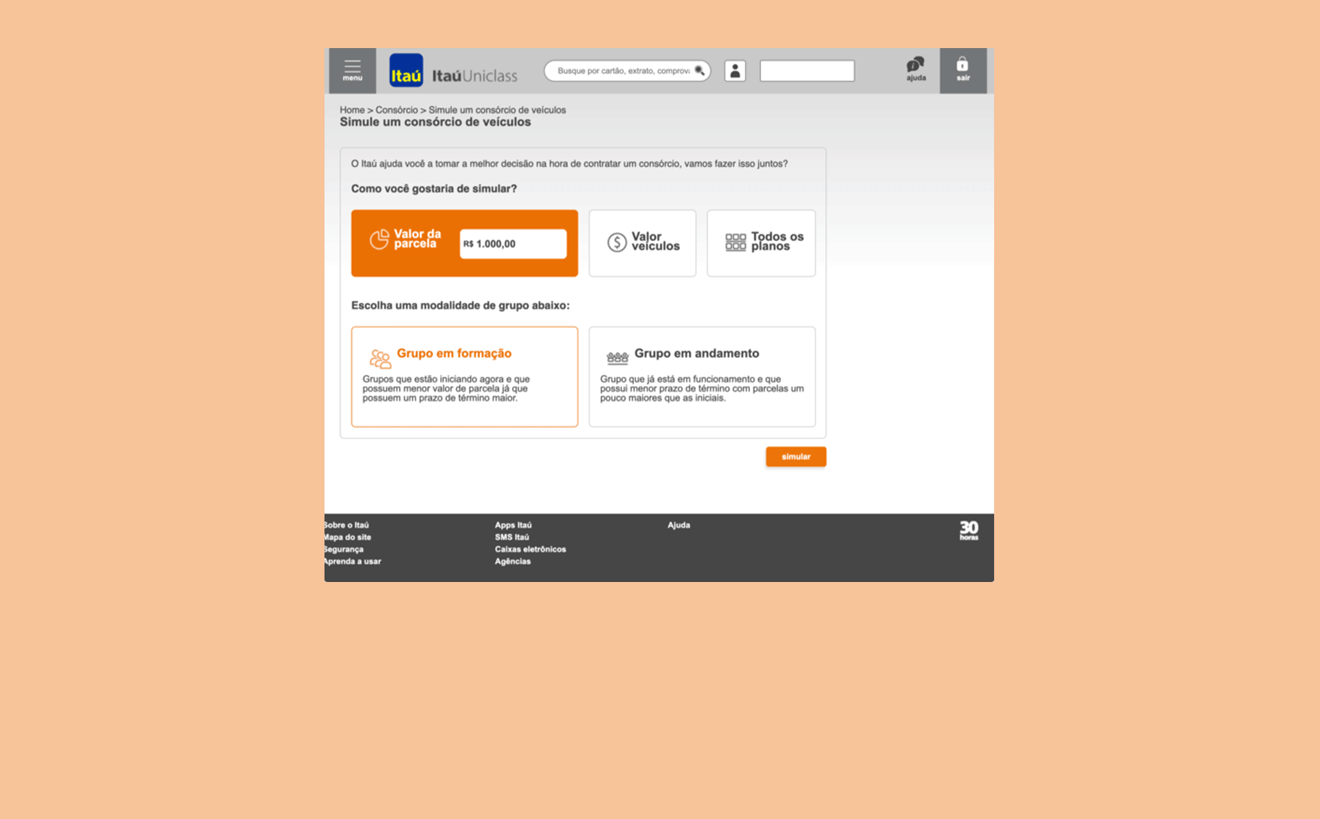
WHAT THE OLDER EXPERIENCE HAD PROS AND CONS?
In the old version (the image above represents some of the screens) there were many opportunities for improvement, both in experience and content:
1. There was no clear separation between the simulation and the hiring moment;
2. Contents were added over the hiring flow which resulted in confused information;
3. Information about tax was hidden and unclear;
4. There was no information to assist the customer in choosing to join a new group of people or an existing one (a very important choice because it influences the value of the monthly payment directly);

03.
Wireframes and metric map
WHAT WE WANT TO VALIDATE IN PRODUCTION?
For each screen and experience, I went into a deep analysis to understand what kinds of metrics and numbers would be interesting to measure in production.

04.
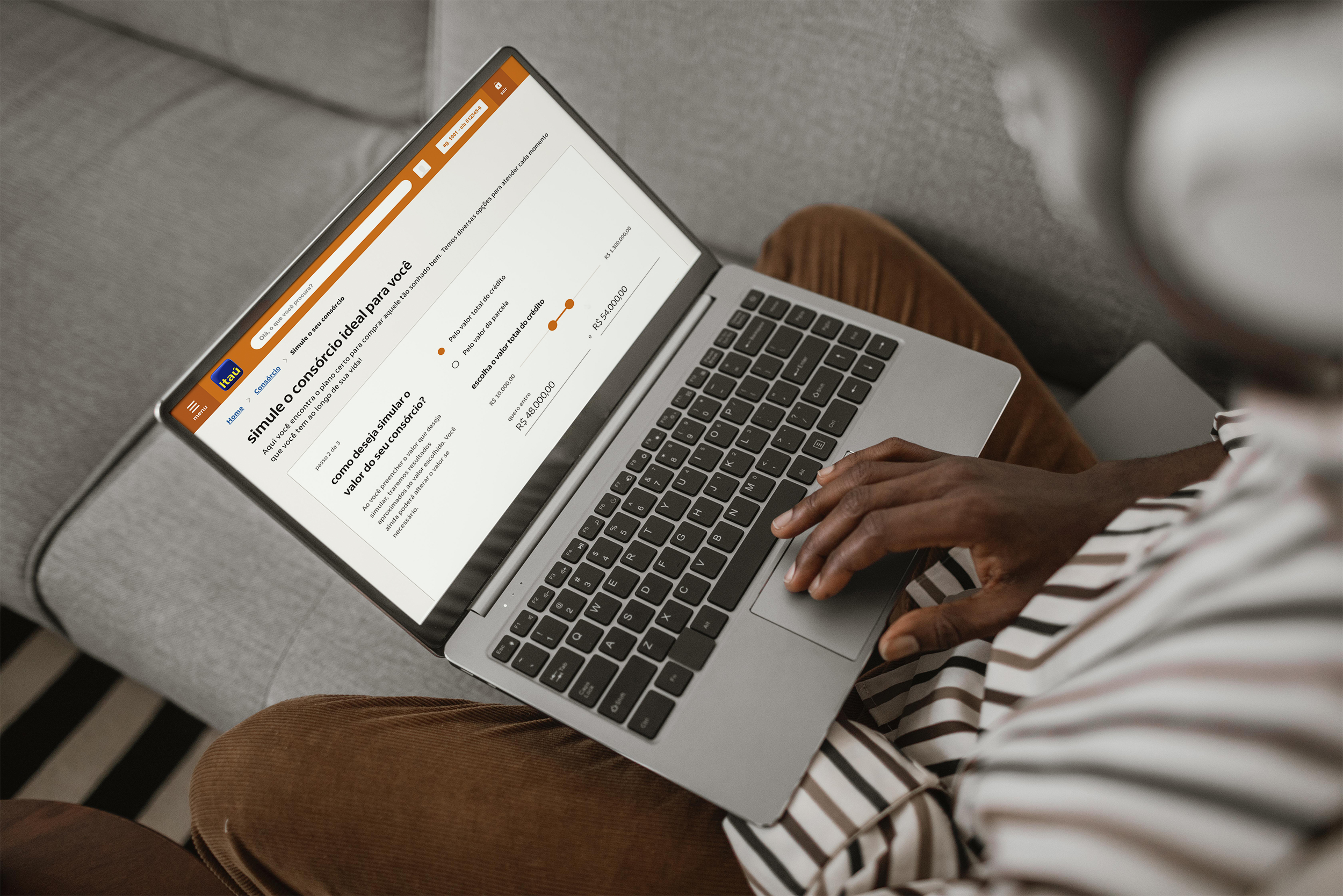
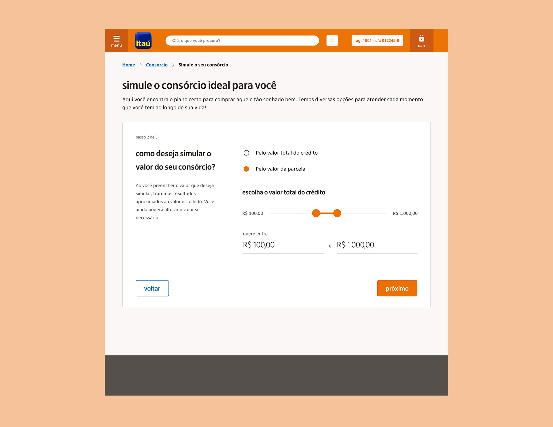
Bringing clarity in simulation
ALL INFORMATION THAT THE USER NEED
One of the challenges of creating this simulator was to put all of the information the customer asked for in the research, respecting all the accessibility requirements for digital content, which Itaú follows faithfully.
In this scenario, I made several studies on the application and use of fonts in the layout, it was necessary to stick to the requirement of minimum color contrast and minimum text size so that the content was fully readable.


05.
Differentiating simulation from hiring
HOW TO BE TRANSPARENT IN A LARGE FLOW
The challenge of redesigning the hiring journey was to balance all legal information and at the same time keep a more streamlined and friendly experience.
We worked with the most detailed information for each installment (as there is a variation in rates, it wasn’t fixed) to make the flow as transparent as possible.
So, the customer can choose to hire a consortium with or without insurance. For this, we provide the information in a way that the customer is aware of all coverage and values if he wants to hire the insurance as well.


06.
Before and after
Besides the new experience brought the brand presence stronger than older interfaces, it was planned to attend better the screen resolutions and acessibilty.
LEARNINGS
Consortium was one of the oldest Itaú's products, that's why we didn't have any metric or data to start the project. We had to find ways not to run out of guides. This is an example of when we can strenghten the user research value.