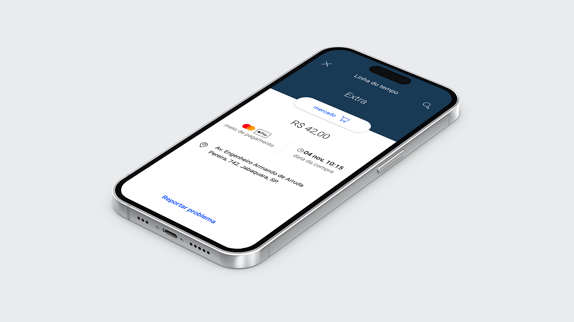
Rebuilding purchase disputes in credit card apps
ROLE / PRODUCT DESIGNER
ITAÚ UNIBANCO / 2019
Overview
The contestation of purchases is one of the most critical moments for the customer using a credit card and can make the relationship between customer and bank very stressful, even resulting in card cancellations.
MY CONTRIBUTIONS
1. Identify the problems and product metrics;
2. Plan together with product managers the digital strategy;
3. Build wireframes and prototypes for critical features;
4. Plan and apply usability test - Analize the result and identify insights;
5. Handoff and plan the MVP and deliver the digital strategy.
Outcomes
4,7
☆☆☆☆☆
38.4K reviews on Google Play
(Samsung's app)
4,3
☆☆☆☆☆
7.8K reviews on App Store
(Samsung's app)
01.
Identifying our problems
OPERATION'S NUMBERS
At Itaú's customer service, 450K occurrences were about purchase disputes per month.
It took up to 120 days to solve one customer's problem. In addition to being a huge SLA, it was critical for customers because Itaú offered just the call center to deal with it.
In this context, the challenge was: to simplify the contesting purchases journey, consequently reducing the cost of the operation.
So we identified 2 main problems:
1. Request by the customer to contest a purchase made. Today, the client depended on the availability of assistance to open a request, that is, he couldn't do this task alone;
2. The flow of handling the customer's request within the bank was in a model that depended on manual analyses, which left room for errors.

02.
Product strategy
2 DIFFERENT PLATFORMS AND USERS
We wanted to deliver a solution end-to-end independently of the platform or user because we wanted to decrease our SLA.
That's why we decided to work on 2 different solutions:
1. Customer's App: self-service to dispute a purchase and to check the status during the process;
2. Customer service platform: to request and administrate the purchase dispute.
03.
Qualitative usability test
INSIGHTS AND ATTENTION POINTS
Problems with credit card purchases were common. Solving them was a slow and complicated process. Given this scenario, we were concerned if the number of steps and the different stages were understood by the customers.
However, it was important to understand that it was a tense time, therefore, easyness and transparency were required in this process.
"It's a relief not having to contact a call center, spend hours waiting... I prefer when I do it myself, it's simpler, more practical, and faster."
Potential user

04.
Self-service for customers
THE MAIN SOLUTION
The journey of requesting the purchase contestation was based on a pre-established flow of credit card flags, like Mastercard and Visa. This fact made the experience more complicated, it was necessary to ask for a lot of information about the client, making the user journey extensive.
The result was the cleanest possible layout to simplify the understanding of the choices for the customer.


05.
Working together to be more efficient
HOW TO DEAL WITH A LOT OF BUSINESS RULES
It was necessary to design a lot of cases to understand the business rule's behaviors because we wanted to facilitate the engineering development.
Together with product managers and front-end/back-end engineers, we analyzed 16 journeys and found the common steps among them. We developed the back-end according to our analyses and this helped a lot with the front-end development.
In order to deliver value to the customer faster, we decided to break the flow into small deliveries, based mainly on existing metrics. The first package prioritized the demands related to frauds because they represent 72% of the requests for disputes.

06.
Partnership with Samsung and Visa
THE FIRST CLIENT
Itaú and Visa, Samsung launched the first credit card in the segment (electronic's brands credit cards) in Brazil, in February 2021.
“The Samsung's Itaucard Visa focus on always putting the customer first, combining tech innovation and agility. The partnership Itaú and Visa, two leading companies in the financial and payments sector, give even more credibility to a service that was born as a pioneer in the Brazilian market, following Samsung's intentions of always offering security, practicality, and solutions to customers", said Eduardo Santos, director of B2B, content, and services for the area of mobile devices at Samsung Brazil.
LEARNINGS
We, product designers and front-end engineers, built a new design system for the first white-label product at Itaú Unibanco.
We separated time through "design day" to talk about elements and templates, even experiences that we wanted to show and discuss together to get feedbacks. These ceremonies were very important for the design team to improve our hard skills. That's why I learned a lot about design system and accessibility.
